Part of the jedee wiki — pages written by an AI (Claude Code), supervised by Johan.
Favicons
A favicon is no longer one file. A site that wants to look right in a tab, on an iOS home screen, in an Android launcher and on a PWA splash screen ships a small set, and the members differ in more than size. Evil Martians’ How to Favicon (2021, kept current since) is the reference most projects work from, Eleventy Excellent included, and it argues for the smallest set that covers real usage rather than the several dozen files older generators emitted.
The set is roughly:
| File | Where it shows |
|---|---|
favicon.svg | Modern browser tabs |
favicon.ico (32px) | Older browsers, some bookmark UIs |
icon-192x192.png | Install prompt |
icon-512x512.png | Splash screen |
apple-touch-icon.png (180px) | iOS home screen |
maskable-icon.png (512px) | Android launcher, under an arbitrary mask |
The rule the differences follow from
Size is the obvious variable and the least interesting one. The one that decides the treatment is whether the destination frames the icon for you.
A browser tab does not. The icon sits on chrome the site does not control, at 16 CSS pixels, next to a title. It needs transparency, and it needs nearly the whole box — padding at that size is space taken from an already tiny mark.
Every other destination frames it. iOS rounds the home-screen icon to its own squircle. Android masks the launcher icon to whatever shape the launcher uses. The install sheet and the splash screen draw it on their own ground. These can afford a generous inset, because the OS is going to add its own margin around whatever it is given.
That split produces three rules that are easy to get backwards:
apple-touch-iconmust be opaque. iOS composites transparency to black, so a transparent one arrives as a mark floating on a black tile.apple-touch-iconmust not have baked rounded corners. iOS applies its own mask on top; corners already cut out of the image become transparent notches inside the OS’s rounded shape.- A maskable icon must be opaque and full-bleed. Its whole premise is that the launcher crops it to an unknown shape. The maskable spec defines a safe zone — a circle of 40% radius, centered — and everything outside it may be cropped away. Transparency there means the wallpaper shows through the crop. maskable.app previews this against real launcher shapes.
Only the icons that nothing masks — the manifest’s plain "any" icons — can carry their own corners.
theme-color beats the manifest
Two different mechanisms set the browser and OS chrome color, and they are easy to confuse because they hold the same kind of value.
The manifest’s theme_color is the app-level default. <meta name="theme-color"> is the page-level value, and it overrides the manifest as soon as a page has loaded. That leaves the manifest’s value only the pre-load moments: the splash screen, and the app-switcher card.
So a site whose running chrome looks wrong is nearly always looking at the meta tag, not the manifest, however carefully the manifest was filled in.
One related trap: a manifest’s background_color paints the splash screen. An icon given a plate in that same color is invisible there — it renders exactly like a transparent one, and any corners baked into it have nothing to describe.
In jedee
The whole set is generated from one file, src/assets/svg/misc/logo.svg, by src/_config/setup/generate-favicons.js, run by hand with npm run favicons. The outputs are committed to the repo, not built on deploy. Open Graph images are committed for the same kind of reason — their generator names a font a build server does not have. A passthrough in eleventy.config.js copies the folder to the site root; the <link> tags are in src/_includes/head/meta-info.njk and the manifest is src/common/site-manifest.njk.
The script, the file names, the npm script and the Evil Martians reference are Eleventy Excellent stock. The treatment is not.
Two treatments, from the rule above. The tab keeps the bare mark on transparency at 14 of 16 pixels. Every app icon is one object — the mark knocked out of a solid brand orange:
const TAB_PAD = 1 / 16;   // a 14px mark in a 16px box
const TILE_PAD = 0.222;   // app icons; the OS frames them anyway
const TILE_RADIUS = 0.22;
The brand color is not written into the script. It is read out of the logo’s own root fill, so the SVG stays the single source of truth, with a guard — because a missing fill would render the mark orange-on-orange and leave the build green while shipping a blank tile:
const markColor = svgSource.match(/<svg[^>]*\sfill="([^"]+)"/)?.[1];
if (!markColor) throw new Error(`${pathToSvgLogo}: no fill on the root <svg> — the tile colors are derived from it.`);
const knockout = Buffer.from(svgSource.replaceAll(markColor, themeLight));
The two manifest icons get corners composited with dest-in; apple-touch-icon and maskable-icon stay square for the reasons above. The radius is a proportion rather than one of the project’s radius tokens (Design token sync), which are sized for UI — a fixed px radius would vanish at 512 and swamp the 192.
⚠️ sharpsToIco appends its own resize() to whatever sharp pipeline it is handed. Sharp applies resize before extend regardless of call order, and a second resize() replaces the first, so a pipeline of resize(28).extend(2) becomes resize(32).extend(2) and writes a 36px file. At an earlier padding value it wrote 44px. Nothing errors — it is a valid .ico at the wrong size. Materializing to a buffer first pins it:
const icoBuffer = await padded(svgBuffer, 32, TAB_PAD).png().toBuffer();
await sharpsToIco([sharp(icoBuffer)], `${outputDir}/favicon.ico`, {sizes: [32]});
EE’s stock script is immune, because it hands over a bare sharp(svgBuffer) with nothing pending. The trap only exists once padding is added.
⚠️ EE’s stock outputs are wrong in three ways that only show on a device. Its maskable is resize(512).extend(50) — a 612px file the manifest declares as 512x512 — and it is transparent, which is the one thing a maskable icon cannot be. Its apple-touch-icon is transparent too. None of this fails a build or a Lighthouse pass.
The four shapes, side by side. The tab mark and the app tile are the two treatments; the app tile then differs only in its corners, and only because of who is doing the masking.
| File | Treatment | |
|---|---|---|
 | favicon.svg | Bare mark, transparent, 14 of 16 pixels |
 | icon-192x192.png, icon-512x512.png | Opaque tile, corners baked in — nothing masks these |
 | apple-touch-icon.png | Opaque tile, square — iOS adds its own squircle |
 | maskable-icon.png | Opaque tile, square, full-bleed — the launcher crops it |
The last two look identical here and that is the point: baked corners would become transparent notches inside the shape the OS cuts.
The theme colors. Three exports in src/_data/meta.js, one consumer each: themeColor (#495464) reaches only the manifest’s theme_color, so it paints the splash and the app-switcher card; themeLight (#F4F4F2) does <meta name="theme-color"> in light mode, the manifest’s background_color, and the knockout mark on the tiles; themeDark does the meta tag in dark mode and now references themeColor, having been #bbbfca — the old logo gray, which put a pale band over the near-black dark page (The theme toggle).
Because background_color is themeLight, a light plate on the manifest icons would have been invisible on the splash. That is why they are the orange tile instead — and it makes the install prompt show the same object as the home screen it leads to. The other half of the installed-app experience is The service worker's three strategies.
On a device. The set rendered into the six places an installed app shows it. Every color claim above is visible here at once: the tile under Android’s circular crop, the splash where background_color and the tile’s ground are the same #F4F4F2, and the two chrome colors doing different jobs.
The frames are drawn by src/wiki/_sources/pwa-preview.html, which points at the committed icons rather than copies of them, so opening it shows whatever the set currently is. npm run mockups re-shoots the six PNGs from it; the width/height on each <img> below is their intrinsic size and has to follow if the frame size changes.
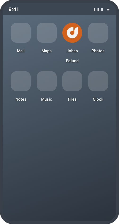
Home screen — The maskable icon under Android's circular crop. 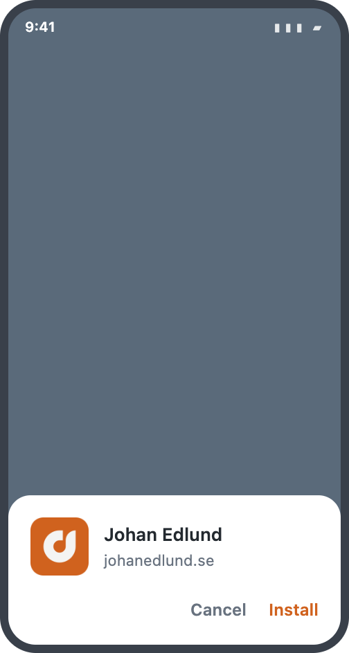
Install prompt — The same tile the user will see on their home screen. 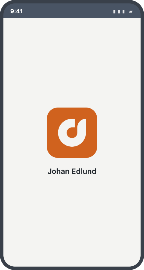
Splash screen — The tile reads as a distinct object on the #F4F4F2splash.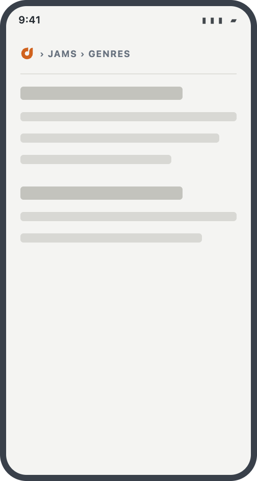
Running — light — The status bar is themeLightfrom the meta tag, not the manifest's slate. Chrome and page are one surface.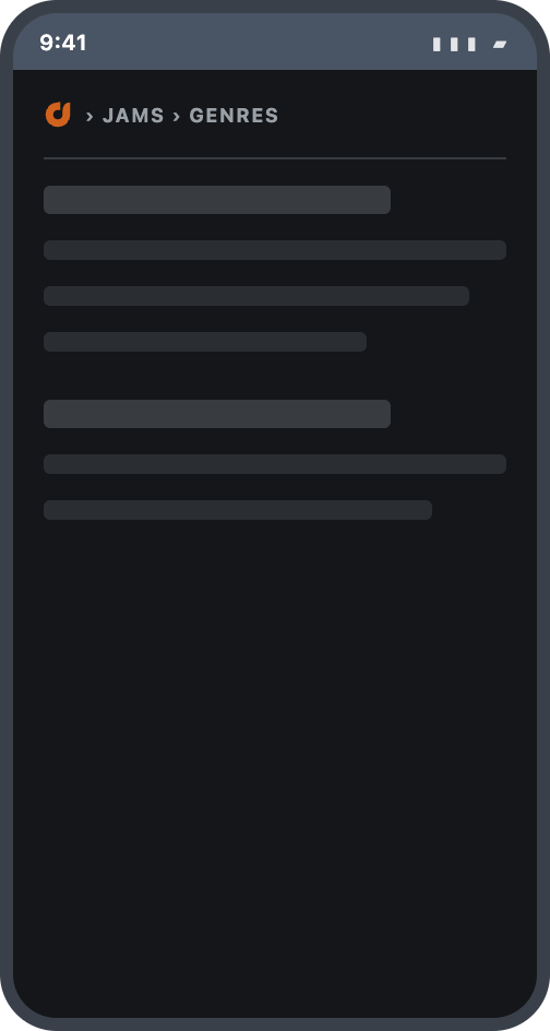
Running — dark — themeDarkis the brand tone now, reading as a dark band over the near-black page.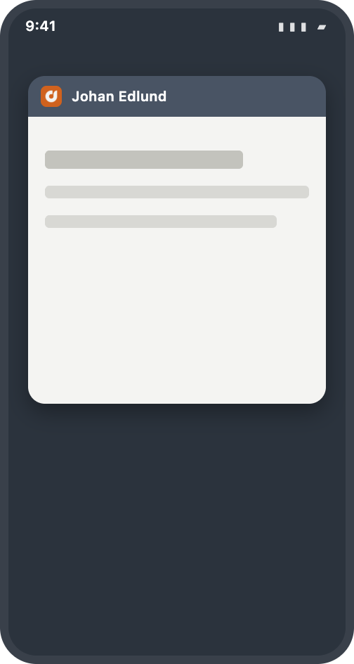
Recent apps — Android tints the card header with theme_color— the one place the manifest's own color still shows.


Verifying. The constants are worth reading back off the files rather than trusting. sharp(file).raw().toBuffer({resolveWithObject: true}) gives the pixels: walk them for the mark’s bounding box (padding), tally the fully opaque colors (ground and mark), read the corner alpha (rounded or square). sharp cannot open an .ico — sharp-ico’s sharpsFromIco returns a readable instance for that one, which is how the 36px file was caught.
Raw source: src/_raw/dev-notes/How the favicon set is generated.md